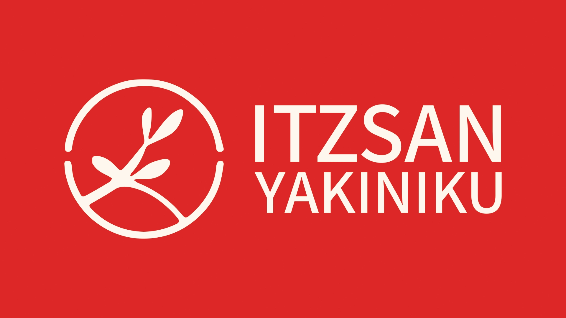

We are excited to introduce our new logo for Itzsan Yakiniku, which features a simple yet meaningful design that embodies the essence of our restaurant. The logo consists of a circle border line, separated into two halves horizontally, with a leaf sprout inside. The color palette is a striking combination of red and white.
Each element of the logo holds a special significance:
- The circle border line represents the unity and harmony of Itzsan Yakiniku’s dining experience. Just like a circle, our restaurant brings people together, offering a space for friends and families to bond over delicious food and memorable moments.
- The horizontal line dividing the circle into two halves signifies the perfect balance between our diverse menu offerings, including flame-grilled meats, sushi, hotpot, and other traditional Japanese dishes. At Itzsan Yakiniku, we strive to cater to every palate, providing a balanced dining experience for all our guests.
- The leaf sprout inside the circle symbolizes growth, freshness, and vitality. This mirrors our commitment to using only the freshest ingredients in our dishes, ensuring that every bite is full of flavor and quality.
- The red and white color palette is inspired by the warm, inviting atmosphere that we strive to create at Itzsan Yakiniku. The red represents passion, warmth, and energy, while the white symbolizes purity, cleanliness, and simplicity – all values that are integral to the dining experience we provide.
Understanding that a significant portion of our customer base is Korean, we have designed our new logo to be inclusive and representative of the diverse culinary influences that make Itzsan Yakiniku special. We hope that it resonates with our patrons and further enhances their dining experience at our restaurant.
Leave a Reply